Read further in the below article providing you with 6 tips and benefits of website navigation-
# Pass the 3 Second Test - Increase the Visit Duration
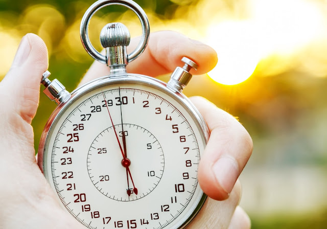
All you have is 3 seconds to make an impression i.e. you have only 3 seconds to capture visitor’s attention.
- Your e-commerce website loads fast
- Your headline captures attention
- Your product category is well defined
- You have proper spacing on your website
- You have clear call to action
Easy website navigation reduces your bounce rate i.e. your customers spends a long duration of time on your e-commerce store.
Go broad and set your site wide!
Some key points to give clear navigation and lead your visitors in right
direction-
- Avoid Pop-ups
- Organize our website well
- Make content readable
- Make website mobile friendly
For giving organized and standardized navigation to your website you need to have a proper design for your website template.
Proper placement of navigation bars, gives consistency to your website theme design. A well-designed website or blog design gives an aesthetic appeal to your visitors. A classification that is set straight gives a better visual hierarchy.
With everything in place, it is easy to navigate as actions begin to become recognizable due to the site's design.
For proper navigation make sure you fit right with the below menus at right places with multi-column design layout and better images.
- Dropdown menus
- Top horizontal bar navigation placement
- Vertical sidebar navigation
- Horizontal navigation
- Sub-Navigation Menus
When you are designing a fresh e-commerce website then navigation plays an important role in the organization for your content.
Planning the content, making it rightly placed is an essential task before you design the navigation.
Properly understand your Information Architecture and manipulate the content as it is what forms the backbone of your website usability.
For Text - Less Is More
Instead of long texts put a few important keywords according to research keywords. Don’t overwhelm! See your content with user's perspective meaning go the client’s way of categorizing your content.
Increase Conversion On Your Website
If your design is confusing, the customer is not able to find proper products, then achieving conversions will be a difficult task. Your website design must be appealing enough such that a prospect gets converted into a visitor, a visitor into a lead, a lead into an applicant or customer or subscriber.
Small facts that invite more conversion to your website-
- Page Speed
- Social Media Integration, reviews and testimonials
- Simple sign-up form
- Fluid Design of Your website
# Serial Position Effect
So if you want to impress your visitors and make them stick to your website than any e-commerce website developer such as BuildaBazaar must ensure easy navigation. Choose themes from ThemeJungle theme store that suits best to your e-commerce store.
With easy monthly subscription get access to other free services of ThemeJungle and BuildaBazaar such as free logo design, free video making, free blog design, free SSL certification and much more exciting services!
Take advice from any e-commerce development company as Navigation is a road sign in your ecommerce store!


